CASE STUDY
BADGER MAPS ONBOARDING
Overview
Proposal for a new WebApp onboarding sequence for Badger Maps, a route planning and optimization app for sales teams
Details
Feature proposal
UX Research, UX/UI Design
2024
Introduction
As of today, the newer version of Badger Maps' app doesn't have any type of onboarding sequence for new users. Research proved that users had trouble navigating the app for the first time and even finding key features. One solution to solve these usability issues is to design a brand new onboarding process.
While the older version of the app does have an onboarding it is very simplified or, in the case of mobile, simply non existent. The new proposal is focused on the WebApp but it is designed in a way that it could easily be exported to the mobile app, thus having an unified onboarding sequence across platforms.
The images and data displayed are the property of Zenzorrito Tecnologías SLU. Zenzorrito Tecnologías SLU authorizes the use of these materials exclusively for this portfolio.
The current onboarding
Before coming up with a new proposal it was essential to analyze the existing onboarding process in order to get a clearer understanding of what is being done and potential room for improvement.
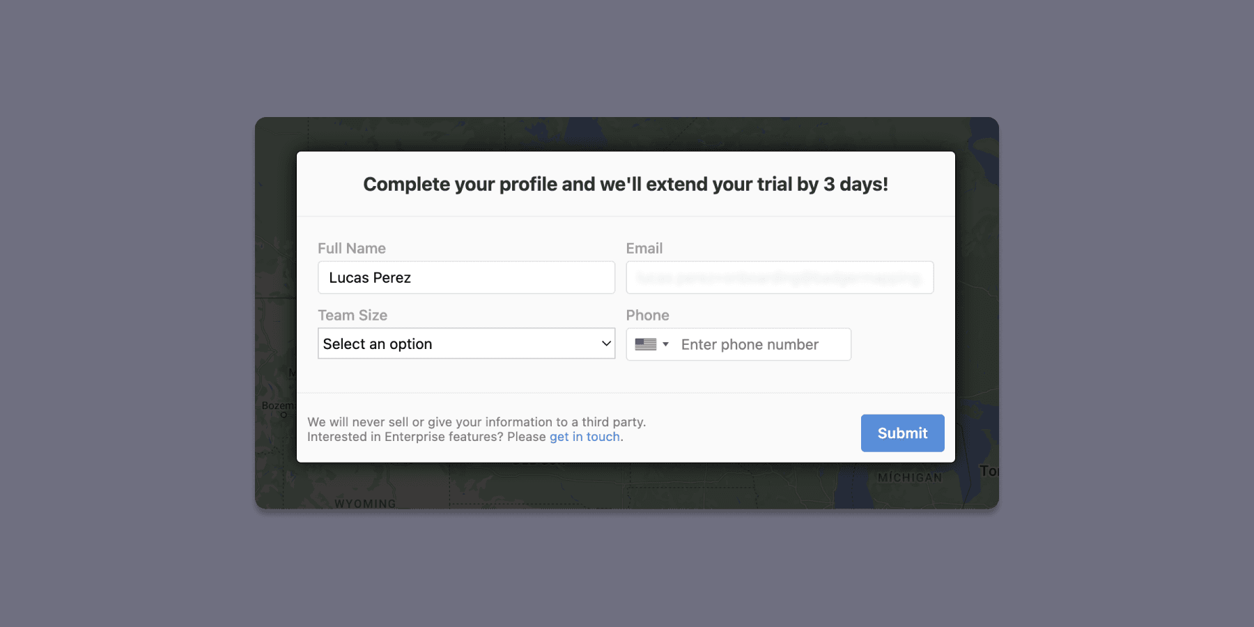
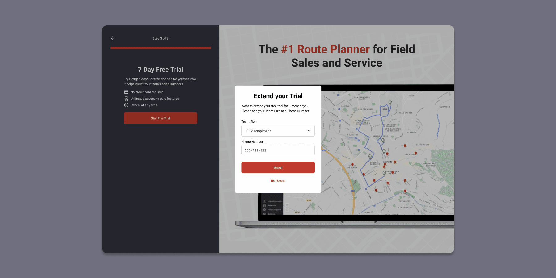
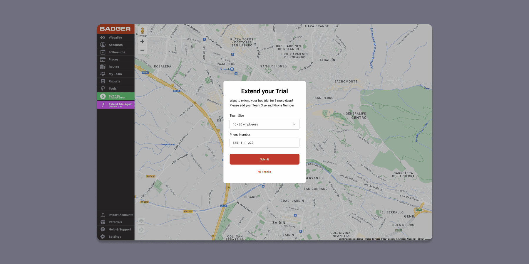
When logging in for the first time after creating an account users are shown a message stating that additional information is required if they wish to extend their free trial for three more days.
This message can be confusing for new users since they might have the impression that after creating an account they would be able to access the app instantly and that no additional information was required in order to complete their profile. One major usability issue is that there is no possibility of skipping this step, so users are forced to submit new information in order to start using the app. Furthermore, there is some discrepancy between platforms as users can actually skip this step if they create their account on mobile first.
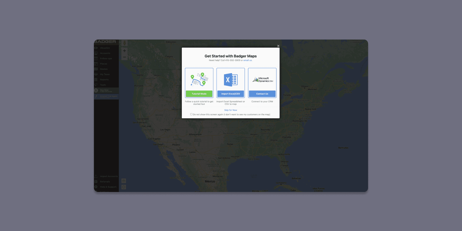
Once the user has submitted the necessary information and effectively extended their trial a new message will appear with different options to get started using the app. This proposal takes heavily into consideration the current 'Tutorial Mode' as the main source of onboarding and it will be the basis of the analysis.
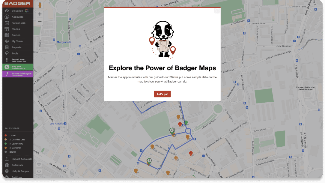
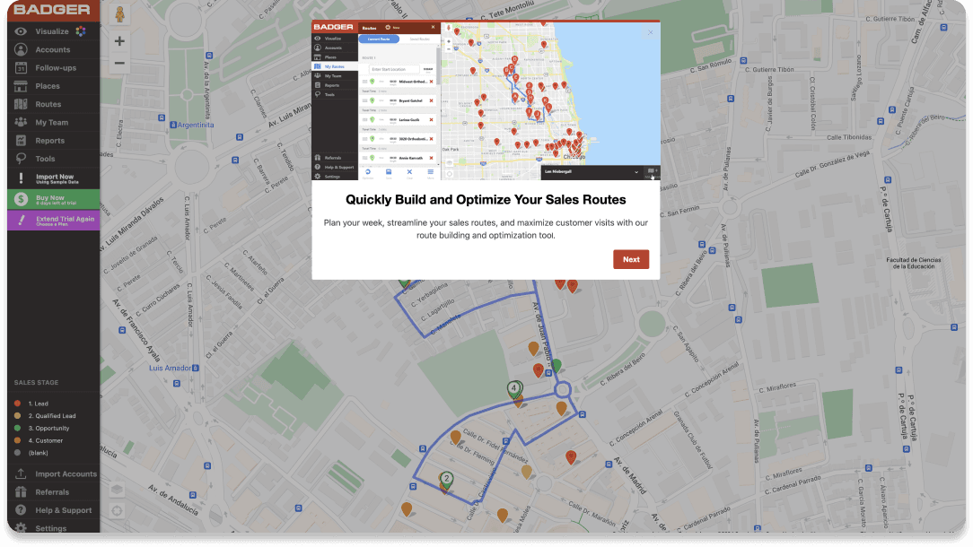
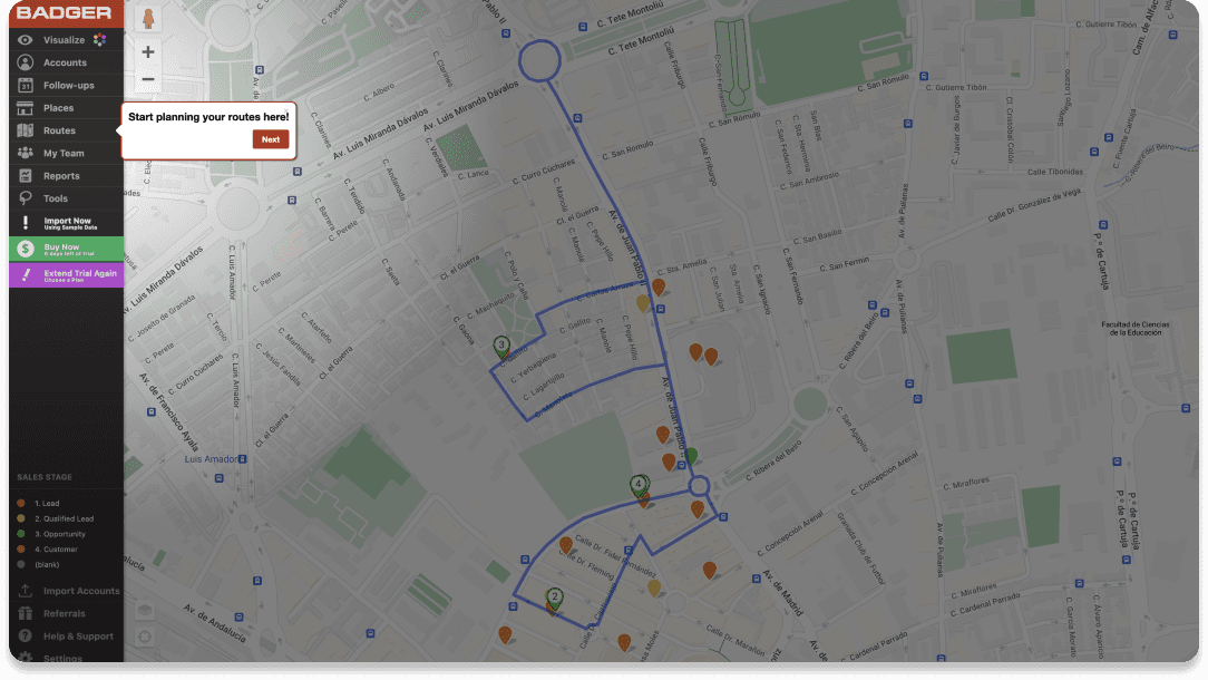
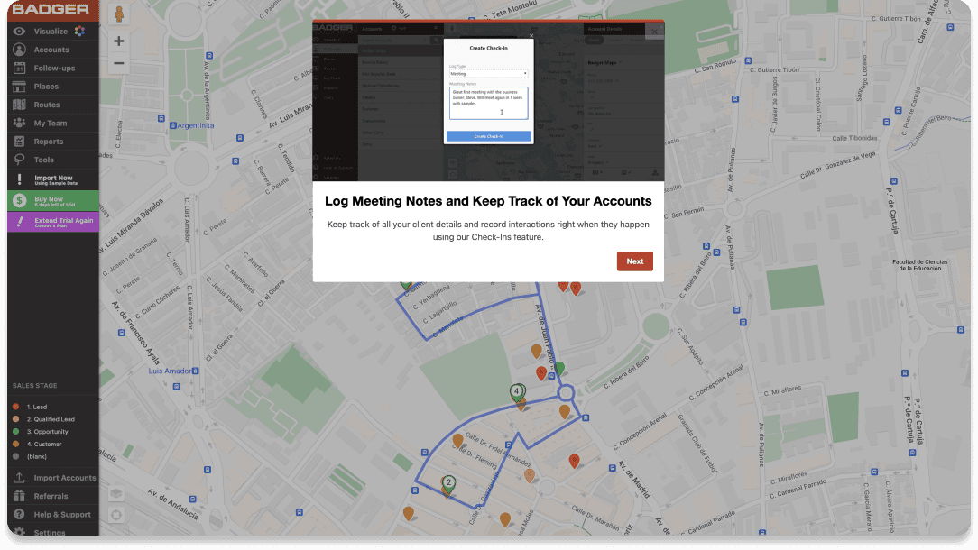
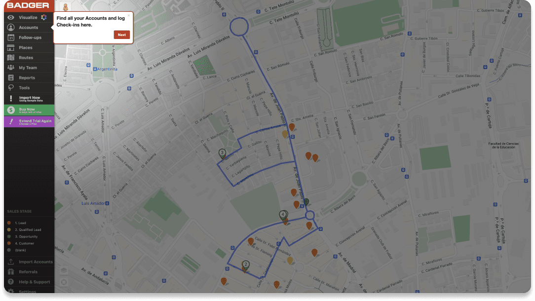
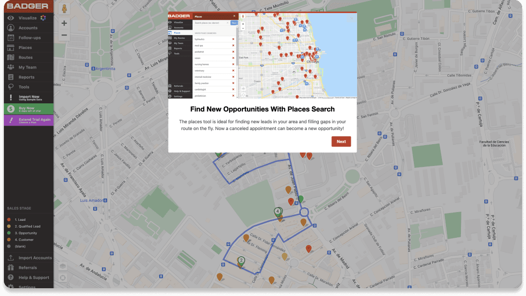
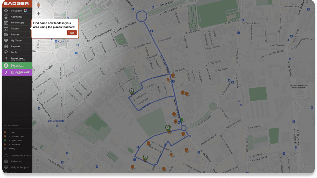
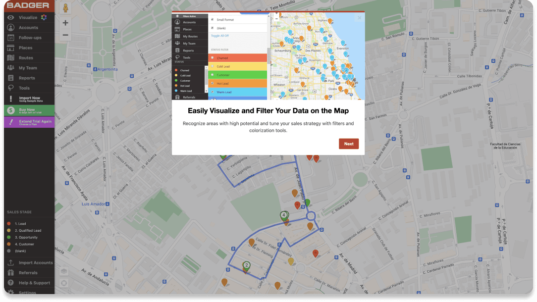
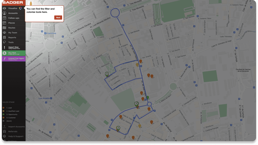
When clicking on 'Tutorial Mode' the onboarding itself will begin with a sequence alternating between general explanations and in-detail messages. By clicking on 'Next' a new popup or message will appear. During this sequence users do not know exactly how long it would take to complete the onboarding. This could result in users navigating through it without paying attention just so that they can finish it fast.
The different messages give users a general idea of how the app works and its main features but without providing in-depth explanations. For example, the message 'Start planning your routes here' will direct to the Routes section of the menu, but once the user clicks on said section no new messages will appear explaining how to actually create and optimize routes.
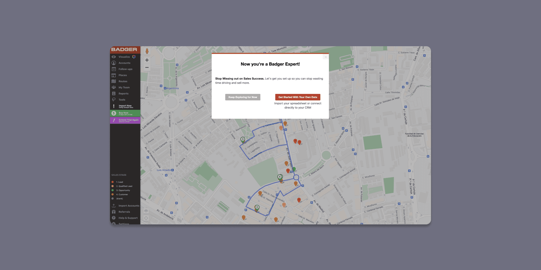
Once the 'Tutorial Mode' has finished a message will appear proclaiming that users are now experts. The wording of this message can be extremely confusing as users have not had the chance to even use the app yet, let alone become experts. They can now either start using the app or learn how to import their data and connect to their CRM. The latter option was not taken into consideration for the design of this new proposal.
A new proposal
The new proposal aims to solve some of the usability issues of the current onboarding process by helping users navigate and understand the product in a more organized and detailed way. The sections of the onboarding proposal will be presented in sequential order.
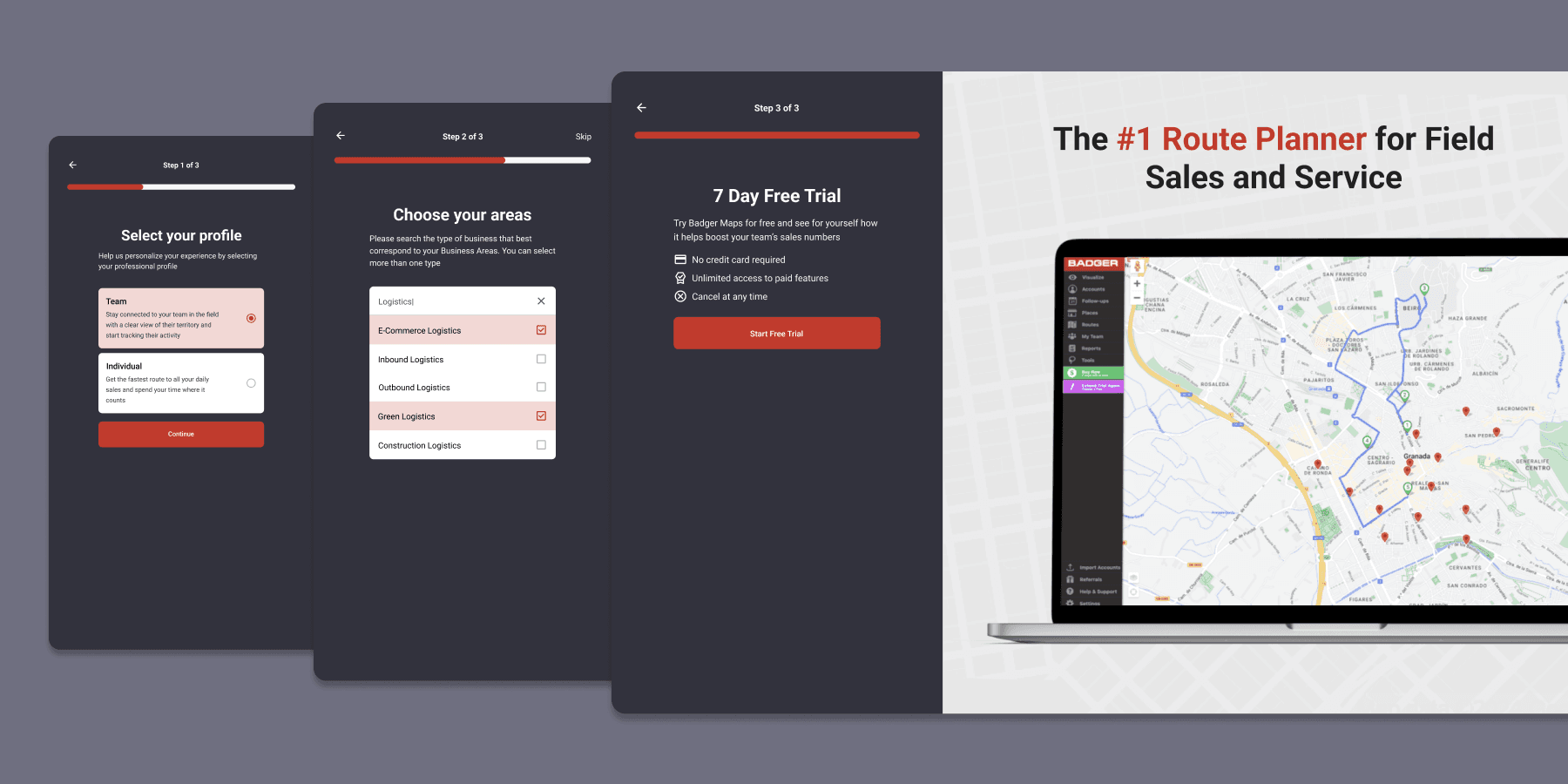
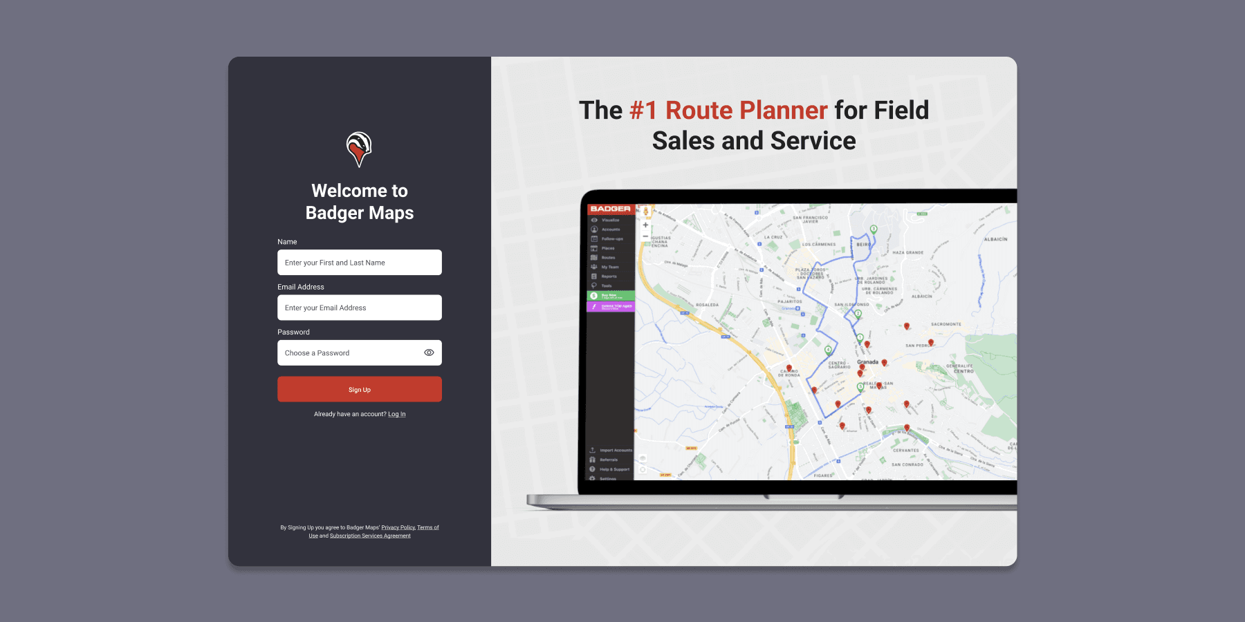
As the very first step of the onboarding process, the Sign Up screen was cleaned up and simplified with a primary focus on the sign up action. Users can still log in through a different screen but it is presented as a secondary action. A message indicating that by signing up the user accepts certain conditions was placed at the bottom of the screen.
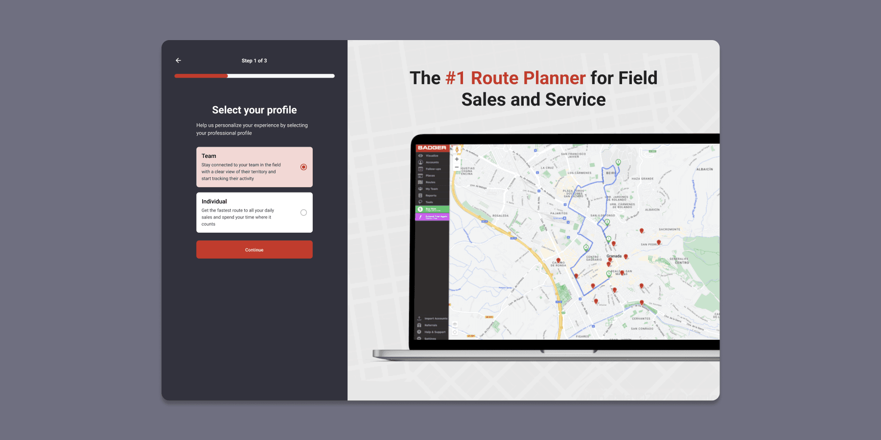
After clicking on the 'Sign Up' button the user will be redirected to a multi step section to complete their profile and create an account. A progress bar is included in order to show users what is expected of them in each step and how long the process will take. This section should not be too long as to not overwhelm users and make the process tedious. Similarly, each step should not require users to fill in too much information.
The next screen is a novel idea where users are asked to select whether they are part of a larger team or are just individuals. Depending on what they choose, the onboarding would branch out and lead them on different paths in order to better tailor their experience. The description of what each option entails should be very clear so that users have no problem distinguishing between them.
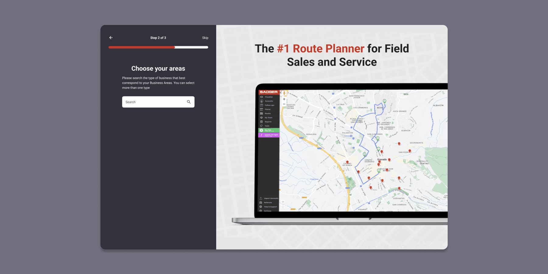
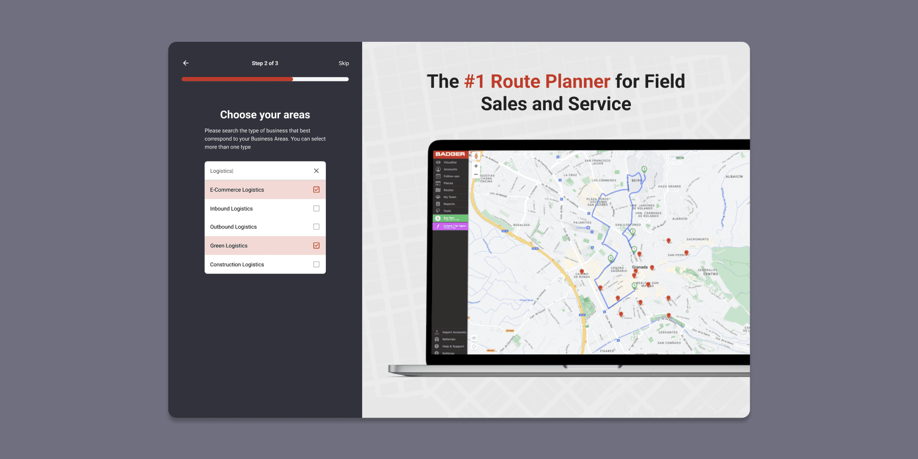
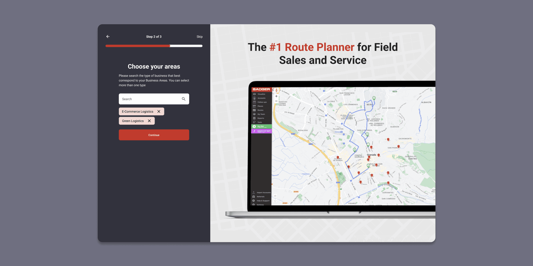
The next step is another innovation where users are asked to select their Business Area. It is important to remark that this step is optional so users don't feel pressured into submitting this kind of information unless they want to. Some of them may not be interested or comfortable in submitting it. From a UX perspective, having an optional step early on shows that the process will not drag on too much and that users can expect the same behaviour in other stages of the onboarding.
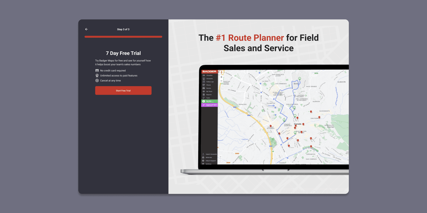
The final step will present what the free trial entails, allowing users to start it. It is important that the messaging makes it clear that no credit card is required to start using the app and that users will be able to access features from the paid plans during this period. Users should also be able to compare the different plans, something that is not available on the current onboarding, forcing users to search for that information on the company's website or on external resources.
However, showing the pricing and billing information right away might confuse some users or even make them leave and not test the app. It is perhaps preferable to let them try the free trial and show that information once it has ended.
The current onboarding lets users extend their free trial from the very beginning. There are several different scenarios for this in the new proposal:
Keep the existing timing where users are asked to submit the information needed immediately after they start the free trial. This message should be skippable and not have users submit extra information to continue.
Ask to extend their free trial after the initial seven days have concluded. In this scenario an 'Extend Trial' popup will appear when the user enters the WebApp.
Ask for the necessary information elsewhere during the onboarding. This would imply having another type of information needed to extend the free trial or simply having a ten day free trial from the beginning.
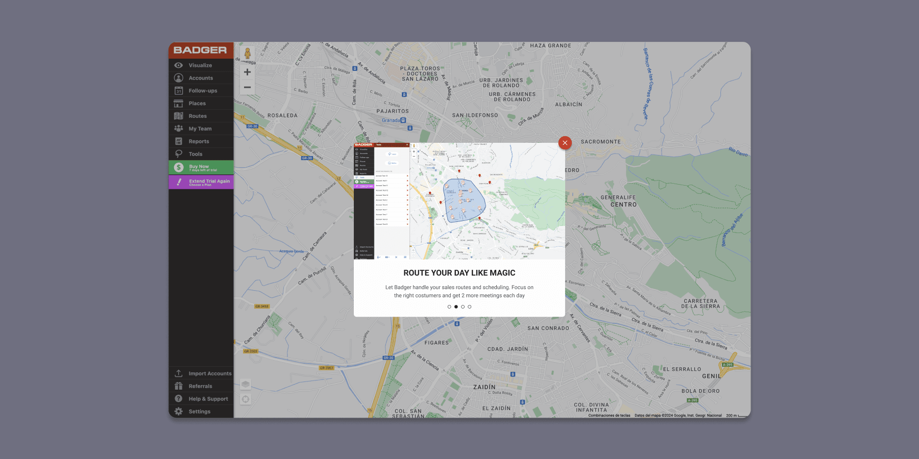
Once the users have created their account and started the free trial a brief set of tutorial screens will appear explaining the app's possibilities. This is a great feature present in the current onboarding as it introduces users to the app and shows the value they can get from using it. However, this section can be skipped in contrast with the old sequence that alternates between brief tutorials and explanation cards breaking the rhythm of the onboarding flow.
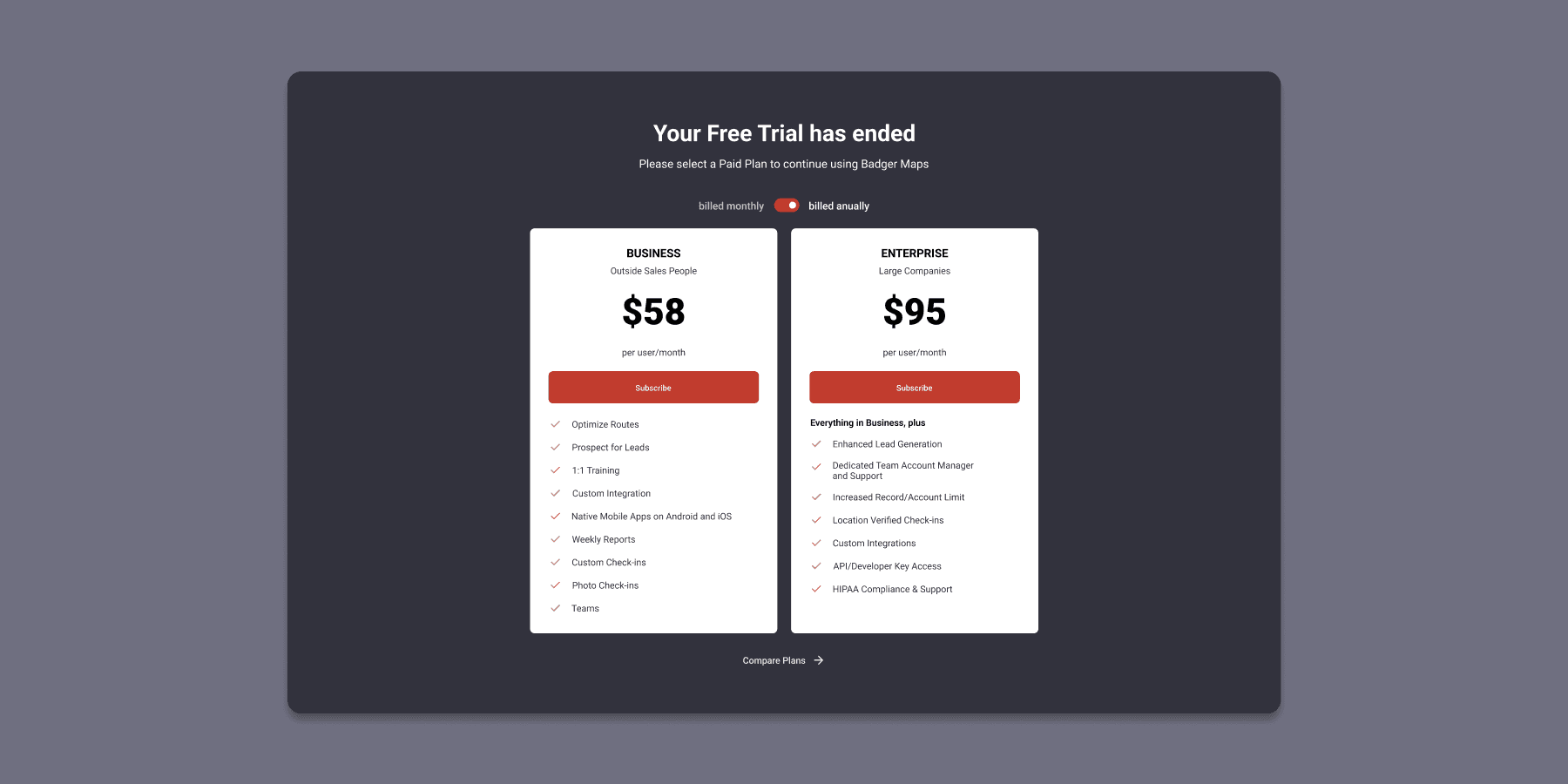
Pricing and Billing information would appear after the user has finished the free trial. The notification blocks the app until the user chooses a paid plan. Users should be able to compare plan features again at this stage of the process.
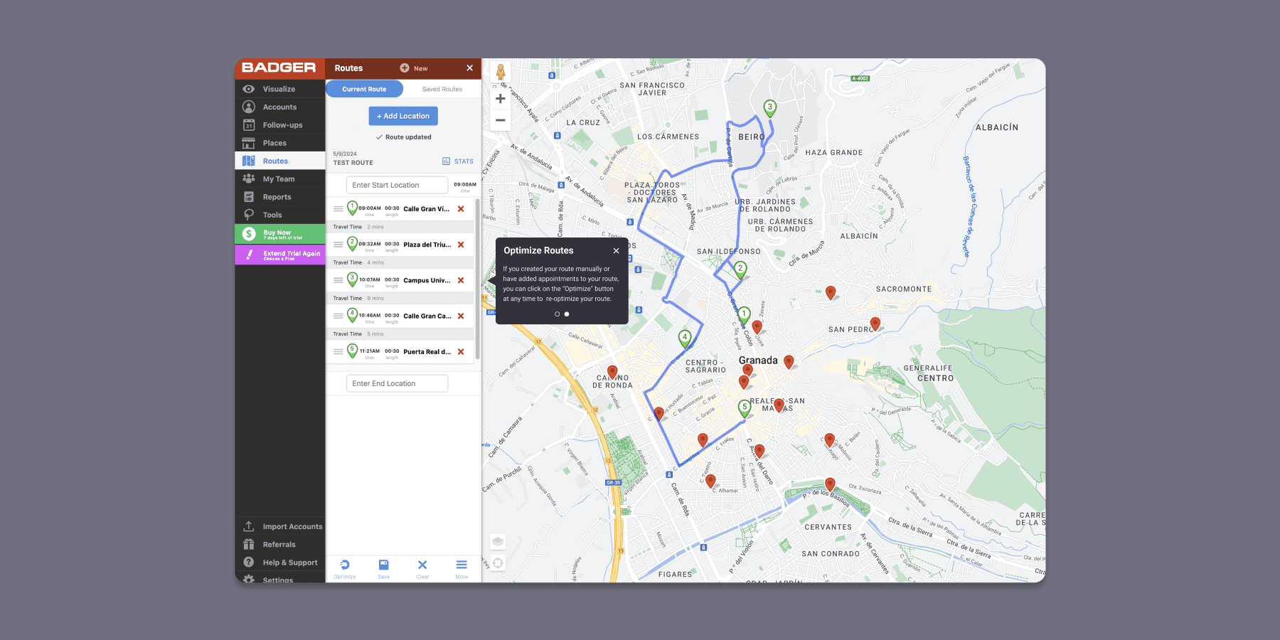
One important feature of this new proposal is having cards explaining certain key flows. These cards should behave as follows:
As opposed to the current onboarding, they should not appear in a sequential order. Instead, they will appear the first time a user accesses certain sections or features. One good example could be route creation as it is a feature that add value to the users and can cause friction.
Users should be able to close the cards. This will indeed close the notification permantently and not show another one. When a user closes a card another card will not appear on the screen immediately after.
Cards will show up during the different steps of a flow. In the example of route creation, they will appear as the user progresses through the flow. They can also range from simple explanations to more complex ones.
One of the main flaws of the old onboarding is that users cannot view the information from the 'Tutorial Mode' later on. This problem is apparent on the sequential order of the onboarding, causing some users to quickly move through it in order to finish without actually paying attention. One potential solution for future iterations would be to have the ability to revisit certain aspects in the form of tutorials or FAQs. This would allow users that either skipped the previous explanations or wish to see them again to do so without the need of exiting the app.
Conclusion
This proposal aims at solving current usability issues during the onboarding sequence with a more intuitive and user centered approach. As stated above, this proposal is flexible and scalable so that it can evolve in future iterations. Extensive user research and testing is needed in order to validate some of the flows proposed.
